Work

Visualizing Change - Designing Enterprise Insights for Reinvention Navigator
Reinvention Navigator is Accenture’s customer-centric SaaS solution that helps companies through transformation. By leveraging generative AI to produce insights, recommendations, and actions that drive change transformation.
As the only U.S.-based visual designer on a global team, I was responsible for translating complex UX wireframes into high-fidelity designs, with a focus on the Program & Project Analysis pages — a suite of data dashboards used by C-suite leaders and change practitioners to track progress across their organization. These dashboards needed to visualize complex organizational data in ways that supported executive decision-making while providing actionable insights for implementation teams.
Problem
The Business Challenge
C-suite leaders projected significant workforce transformations but were hampered by:
- Outdated tracking methods relying on time-intensive spreadsheets
- Rigid approaches to problem identification
- Lack of integrated data visualization tools for decision-making
User Pain Points
Our research with stakeholders revealed three critical insights:
- Cognitive Overload: 90% of users found existing data presentations overwhelming
- Lack of Personalization: Generic interfaces created confusion rather than clarity
- Missing Actionable Insights: Users couldn't effectively translate data into decisions
My Challenge
As the visual designer responsible for the Program & Project Analysis dashboards, I needed to transform complex UX wireframes into intuitive interfaces that would allow two primary users (Change Practitioners and Change Leads) to quickly understand transformation progress and make data-driven decisions.
Solution
My Approach
I developed a visual system for data presentation guided by three self-established principles:
- Clarity over complexity — Surfacing only what matters most through carefully designed data hierarchies and visual emphasis
- Progressive disclosure — Creating interaction patterns that revealed detail on demand
- Visual consistency — Establishing cohesive patterns across multiple dashboard types
These principles guided my work within the constraints of Accenture's established brand guidelines and WCAG 2 accessibility requirements as outlined by our experience design lead and design system team.
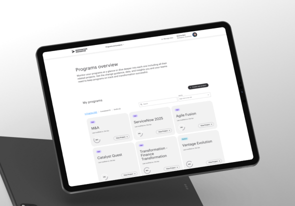
Key Feature: Modular Filtering System
I redesigned the originally proposed "mega-filter" dropdown system into a more intuitive modular filtering system, where:
- Each attribute (location, stakeholder group, workstream) had its own filter dropdown
- Dedicated search inputs improved discoverability
- Visual grouping helped users understand relationships between filters
This redesign was presented during our twice-weekly design reviews, where I gathered team feedback to refine the solution before development handoff. My approach was ultimately adopted as the standard filtering pattern across all dashboard interfaces.
.png)
Collaboration Framework
To solve handoff challenges across our global team (designers in Europe, developers across multiple time zones), I:
- Designed an asynchronous workflow with structured feedback cycles
- Implemented a dual-file Figma structure based on my manager's initial guidance:
- A designer-only working file for iteration
- A developer-specific file with changelogs and annotated specs
- Created the final proposal for version tracking and file organization
- Developed walkthrough videos and documentation to ensure consistent adoption of the new system

Process
Research Integration
Working with findings provided by our dedicated UX research team, I translated validated user needs into visual designs for two primary personas:
- Change Practitioners: Needed granular data access and custom reporting capabilities
- Change Leads: Required high-level progress metrics and stakeholder alignment views
My role began after research and wireframing phases were complete, with UX designers and data engineers handing off wireframe solutions to me for visual refinement.
Visual Design Process
Starting with wireframes from our UX team, my design workflow included:
- Visual Enhancement: Transforming functional wireframes into visually refined interfaces
- Component Development: Creating a scalable visual language for filters, charts, and navigation
- Design Reviews: Presenting designs during twice-weekly team critiques
- Refinement: Iterating based on feedback from design leads and development feasibility
The process required balancing creative direction with Accenture's established brand guidelines and accessibility requirements (WCAG 2) while ensuring the final designs faithfully represented the UX intent.
.png)
.png)

Implementation Challenges & Solutions
One significant challenge was balancing visual richness with performance constraints. I addressed this by:
- Creating simplified visualization states for high-level views
- Designing progressive loading states that maintained visual hierarchy
- Working directly with engineers to understand rendering limitations
Outcomes
Project Achievements
- Successfully designed the complete visual system for all Program & Project Analysis pages
- Facilitated onboarding of the platform's first client before my departure
- Established design infrastructure that supported team growth
Stakeholder Impact
The work received exceptional recognition from executive stakeholders:
"Honestly in all my years working with [the CEO], I have never had a review like this. I hope you are all incredibly energized and proud of the work we have done to date and what is yet to come. This work has been so exciting for me, thank you for everything. The best is yet to come!"
- Chief Leadership & Human Resources Officer
"Echoing [Chief Leadership's] comments - a huge thank you for today and for shaping our future."
- Group Chief Executive Global Automation & Assets Lead
"[Chief Leadership] - Thank you very much for your leadership and guidance - current progress is also mainly because of your direct involvement starting from finalizing the functionality and weekly standup sessions, sprints governance all of it contributed to excellent session. Thank you very much. [Global Product Lead] and team this is a huge recognition - exceptionally done - cheers!!"
- Senior Managing Director, Strategy & Consulting
Personal Growth
This project enhanced my ability to:
- Design scalable visual systems for enterprise applications
- Collaborate effectively in distributed global teams
- Balance visual design with technical and business constraints
Reflection
My experience on Reinvention Navigator reinforced that effective enterprise design requires both systems thinking and clear communication. By focusing on user needs while addressing technical constraints, I helped transform complex data into actionable insights for transformation leaders.
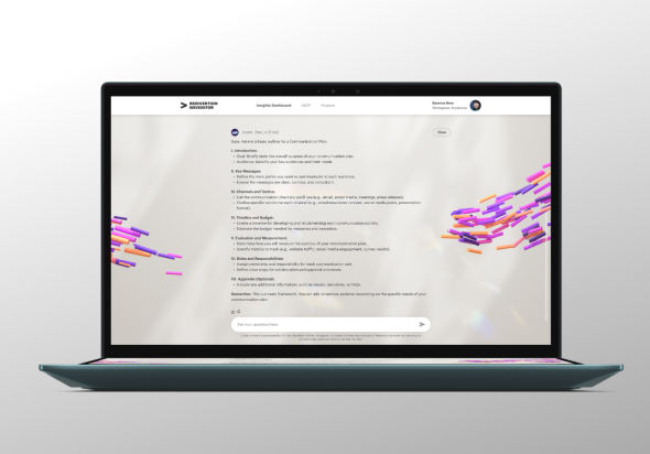
With more time on the project, I would have explored deeper data visualization interactions and contributed to the CORBIS conversational AI interface—combining visual clarity with emerging tech to tackle even more nuanced enterprise challenges.
